Although I liked the big, bold “Maximum” on the old design, I wanted to try something vastly different for the next design. I wanted to create an over-the-top effect with a smaller font size. I used various combinations of broken and debased fonts with varieties of old english and blackletter fonts. Savatoons made the devil horned demon thingy. She was helpful with feedback as I worked. I was thrilled with my logo in the top left. The problem was, it forced my hand with the colors. I had to retain the color scheme with the nameplate. Despite numerous attempts, I don’t believe I ever got it just right. Frank pointed out that the two fonts were disjointed. I designed an improvement, but I never uploaded it in favor of redesigning the whole mess. I’m surprised I left this up as long as I did.
Mk. 3. November 2006 to May 2008
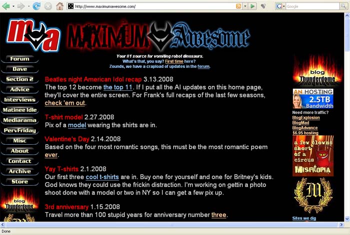
On the other hand, I love the left-hand menu buttons. They rock. I had redesigned my forum in Dec. 2006. I designed menu buttons for MA to echo those. I thought it would help connect the site and the forum a little more. Although the nameplate was up by the end of October, the menu buttons weren’t up until January. The sight of the red/blue nameplate with orange/blue menu bar is one I will spare you. With the red/blue logo and nameplate came a new red/blue CSS. In fact, the whole CSS changed. The resulting home page breathed more. I wasn’t in love with the return of the dark red, but there you go. Despite the many hours I put into it, I consider this design a failure. It always looked disjointed. It never conveyed the over-the-top-ness I intended. The menu buttons are great. The logo is great. But the nameplate is weak, and there is little cohesion to the elements. To me, the words ‘maximum awesome’ are very silly. The nameplate doesn’t capture that. It’s almost intimidating–or faux intimidating…like some dork who just got an OE tattoo of the word ‘strength’ across his back.
 Your #1 source for vomiting robot dinosaurs. Since 2005.

[…] Move on to Mk. 3. […]