I got to the point where I couldn’t stand the nameplate anymore. I wanted a design that echoed the product labels of the early 1900s without looking too dated. The older style coupled with the silly MA name would fix everything I had so far botched. It looks great in my head. You know what the problem with that is? I have to translate that into a graphics program.
Mk. 4. March 2008 to January 2009.
I’m not a draftsman. I can doodle, but I don’t draw everyday. I don’t have a magic ink pen. I’m very limited with the kinds of things I can design well, and even simple designs take me a lot of time to execute properly. I get a lot of mileage out of taking a little innocuous image off the web and modifying it into something else. Sometimes it works. Sometimes it doesn’t. The last two designs relied solely on font manipulation (I think I used at least five different fonts for design 3–that’s generally considered a no-no in designer parlance, but they were similar enough that I thought I could do something interesting with them). This design was more of a true design. I tried a few different font styles around a piece of filigree. I designed a piece of old paper that would serve as the background. I originally frayed the edges and rolled them up like a scroll, but that gave off a medieval vibe. Instead, I decided to use the filigree as a border. I modified a small picture of a pillar and stuck that in to provide the left and right borders. I used a smaller version of the logo in the top left. It looks so much better. I’m not sure why I didn’t do that earlier. I considered changing the menu buttons, but, honestly, I’m not sure what I’d change them to. If I use the filigree, the button text would have to be much smaller. I don’t like that. I like navigation buttons that you can read. In the end, I left them.
I look back at this nameplate now and wonder why I let this draft sail. I can see some thought put into it, but man did I cram in whatever I could find. If the Brooklyn Dodgers designed my nameplate…in Rome…with spare wrought iron handrails and parchment, they would still draft a more cohesive design than I did.
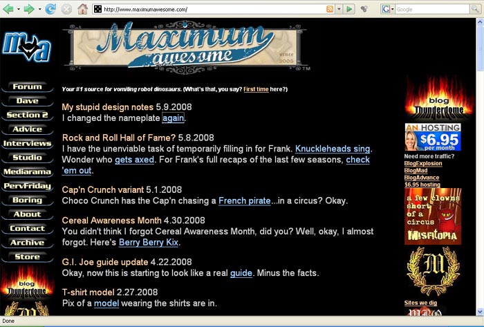
 Your #1 source for vomiting robot dinosaurs. Since 2005.

[…] Move on to Mk. 4. […]