The Mk. 6 is my favorite of the first six designs.
Mk. 6. March 2014 to whenever.
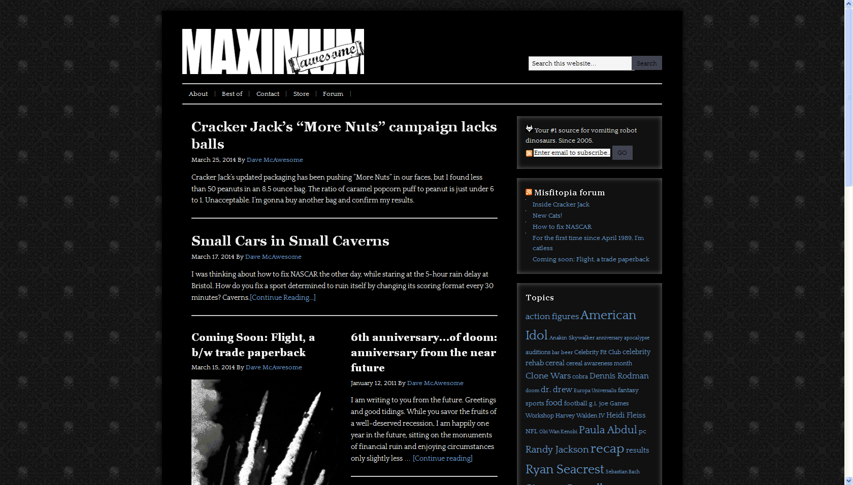
For Frank’s sake, I used Mk. 5 as an excuse to go to black text on white. At the expense of his sanity, I took Mk. 6 back to how I think the web should be: dark and terrible. Off-white text on a black pitch. Skulls here and there. Brash, stupid nameplate. Beauty.
I peeled off the Brooklyn Dodgers style nameplate for something that married an update of the original, bold “Maximum” from the Mk. 1 and Mk. 2 designs with the Dodgers-esque “Awesome” stretched on a piece of scroll paper. Scroll paper is super cool. I started with color, but thought better of it. I don’t know why it took me this long to do a black and white design, but it did.
Back to the Designs of Doom index.
 Your #1 source for vomiting robot dinosaurs. Since 2005.

[…] Move on to Mk. 6. […]