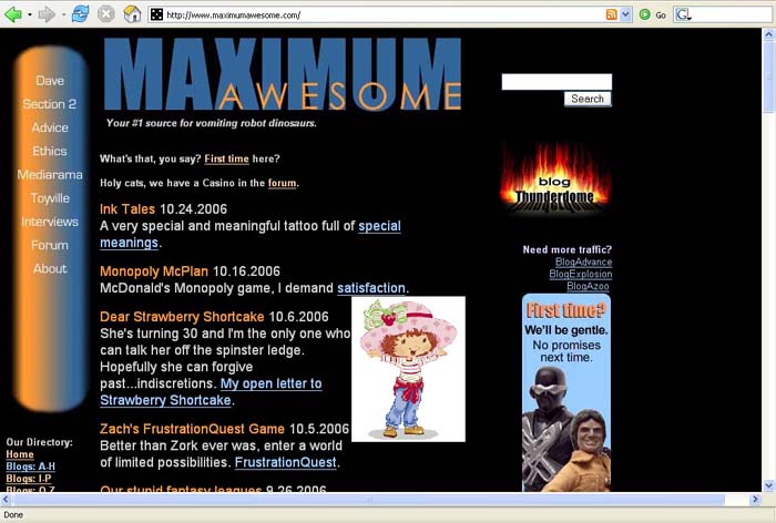
Moving on to design 2. You can open your eyes now. What do you mean they’ve been open? Oh, you poor sod. Move. Ing. On.

January 2005 to October 2006
Week 2 sported this blue/orange combo. Some folks get weird about seeing blue and orange together. Not a lot of Syracuse fans, I guess. I think there’s something genetically wrong with you if you don’t like blue and orange together. They’re complementary colors, fer cryin’ out loud. Complementary. You know what that means?
Blue: You look smashing today, Orange.
Orange: Cheers, Blue. What a cracking tophat you have on.
Blue: Ha, you devil. I didn’t think you’d notice. You did a fluminious job with your tulips this year. I’ve been meaning to mention that.
Orange: Cheers again, mate. You’re quite fluminious yourself.
That’s called a cheap laugh. It has a street value of 32 cents. Thirty-three in Washington Square (damn those immoral NYU kids…). That’s the trouble with complimentary/complementary.
I wanted to get away from the red and purple. It was too dark, but I always wondered if the light blue and peach were too light. Overall, I liked this simple design. The left gradient took me several tries to get it just right. I rounded the top ‘by hand,’ so to speak, with a swish of a soft erase brush. It was one of those, “I can’t believe I got it; let me save this quick before lightning strikes my computer and summons Thor who poops all over my files” moments. I tend to have those occasionally. The bottom line is: I like this. I don’t love this. It’s okay. Serviceable. Not quite fluminious. Adequate. It brims with adequacivity.

[…] Let’s move on to Mark 2. […]