It began in ugly fashion in January 2005. I pooled all my html knowledge together in late 2004 to cobble what has to be the most randomly stitched-up site since blinking gifs fell out of style. Doubtless, you remember the first anniversary article in which I reminisced about the very first design of this site. Let’s look at it again, shall we? Close your eyes…
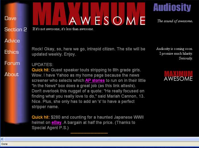
Mk. 1. January 2005. Why I thought such a dark font was okay is beyond recollection.
This is the Mark 1 Jan. 2005 design. Boy howdy. In my defense, I was focusing on making sure the site functioned properly more than anything else. This was my very first foray onto the–I think you call it the ‘Intercrap.’ Look at the bottom. I used the European day-month-year format to date the updates. I only succeeded in confusing myself. Yes, I grant it is a superior system with a sound internal logic. Alas, I am a dumb American. Month, day, year for me. This lasted about a week.
Let’s move on to Mark 2, or go back to the Designs of Doom index.
 Your #1 source for vomiting robot dinosaurs. Since 2005.

[…] Mark 1 – The ugly beginning. Some say it only got worse. […]